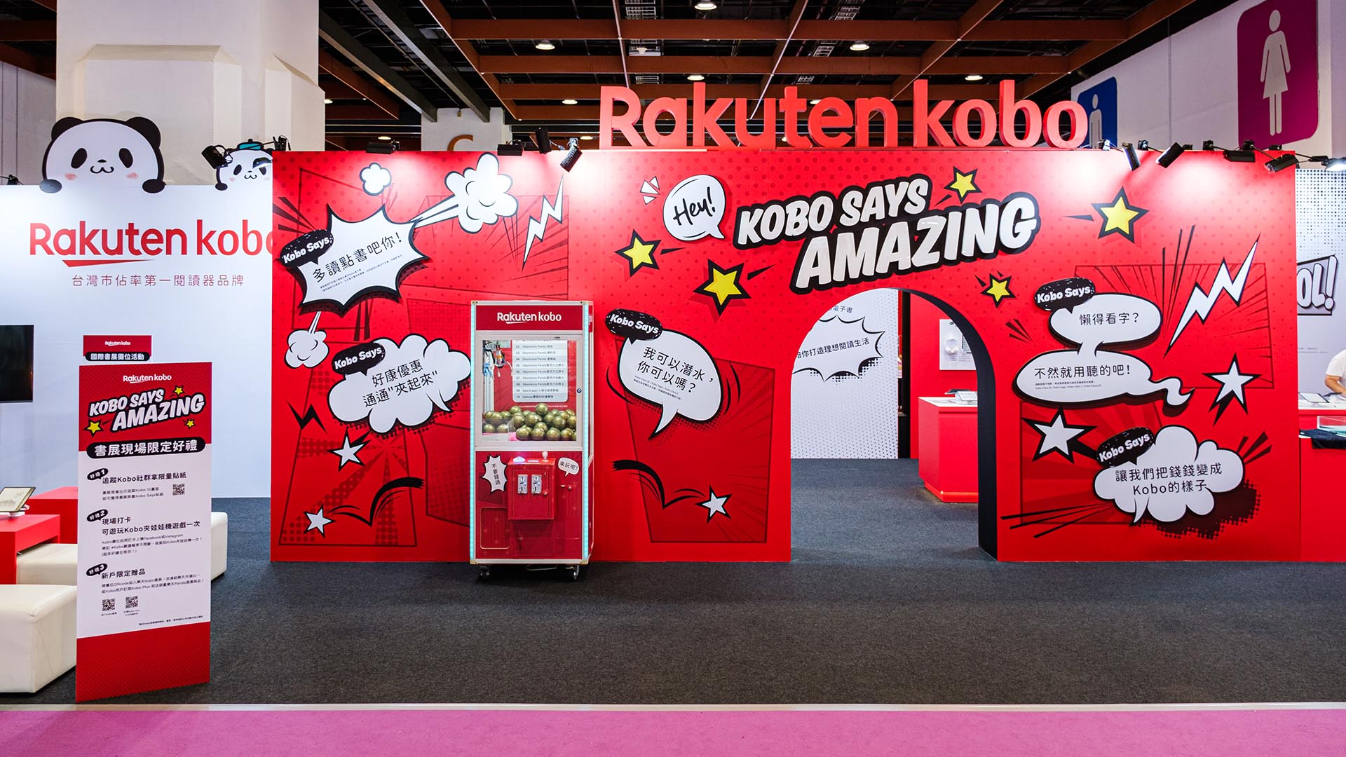
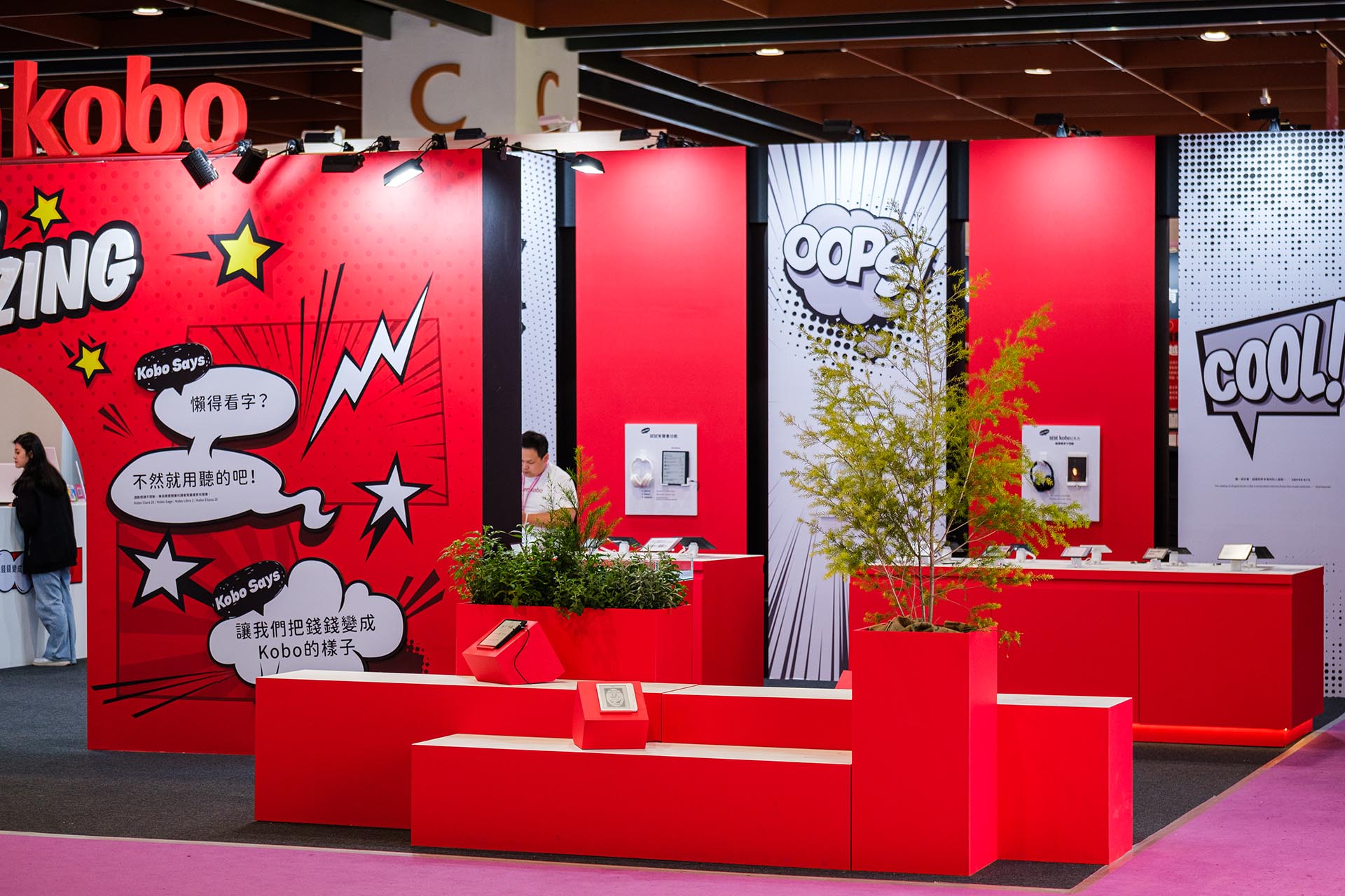
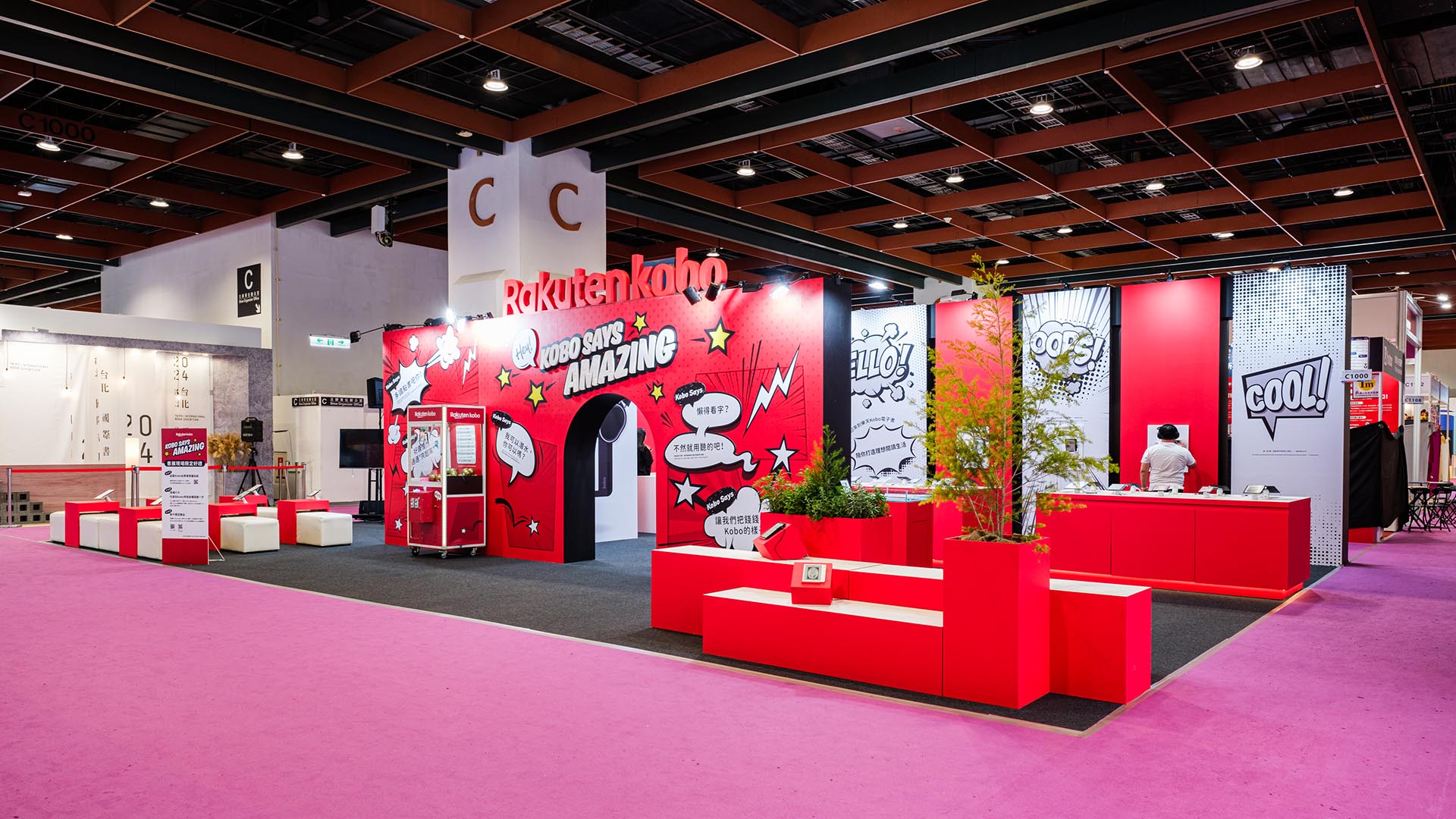
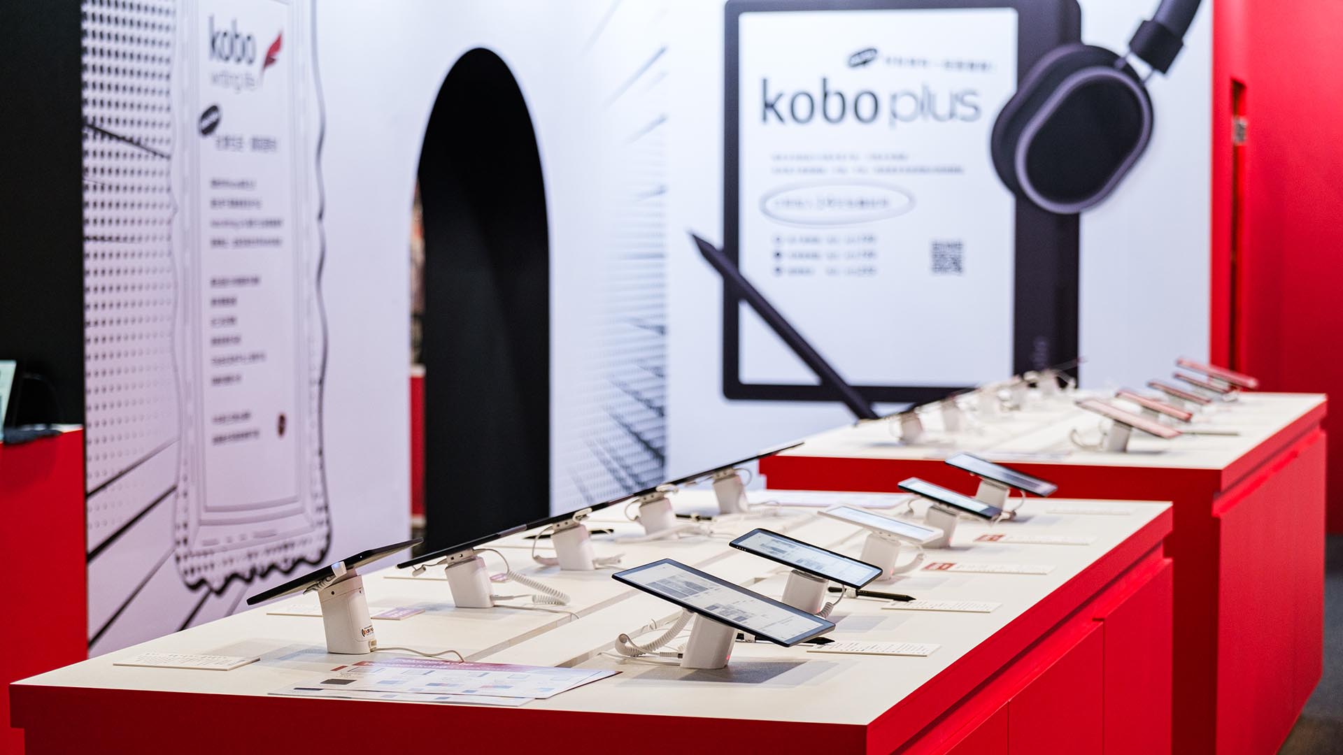
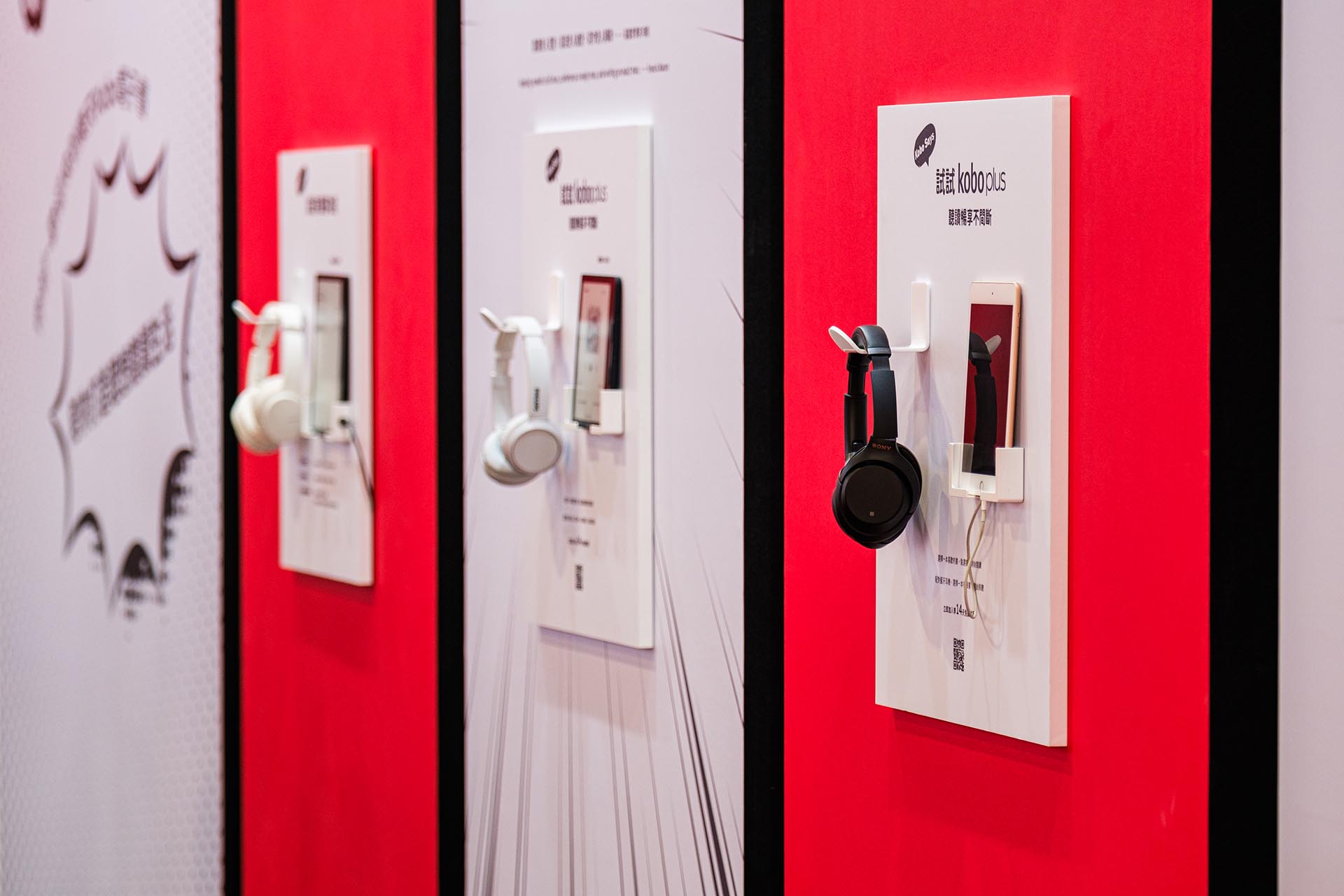
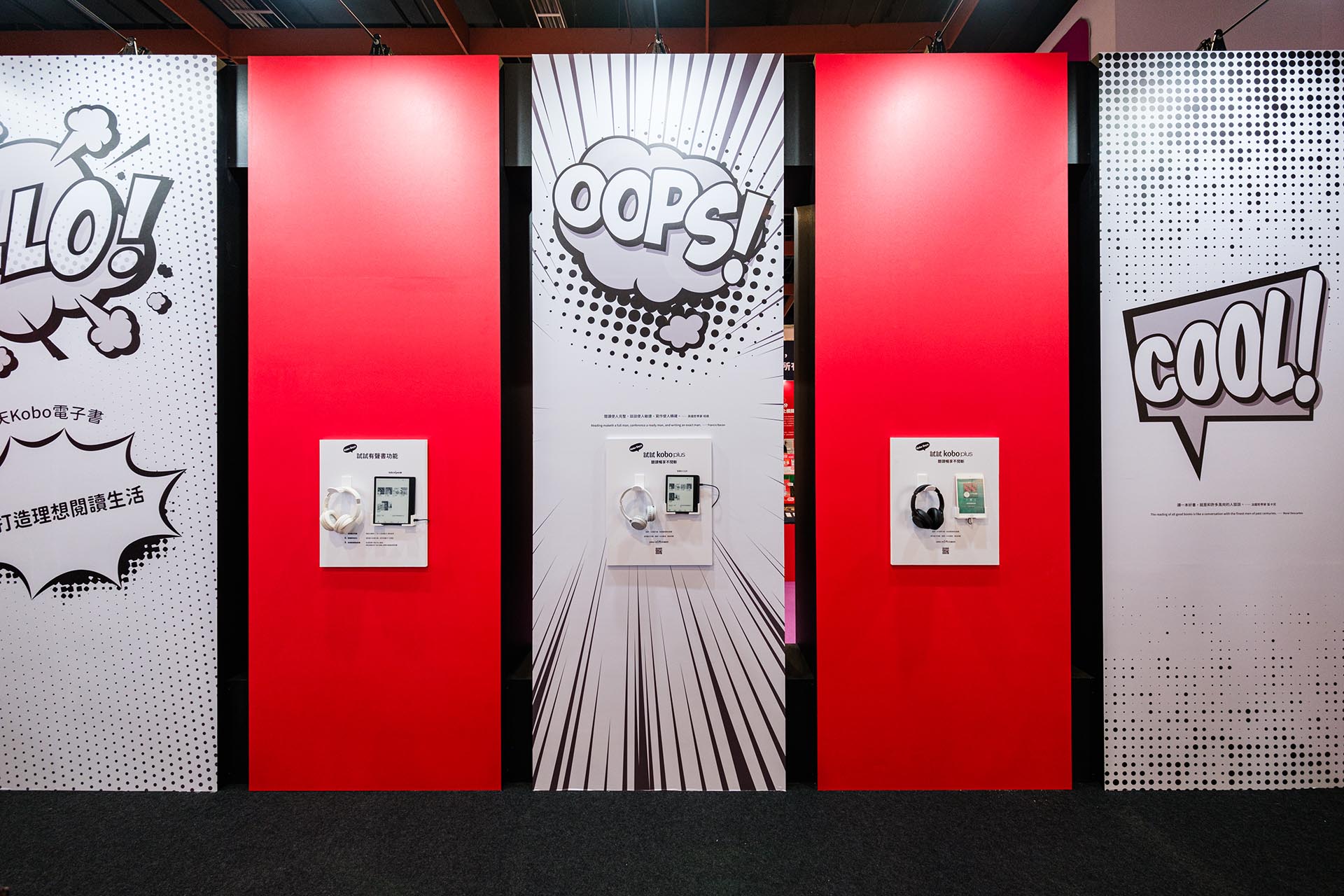
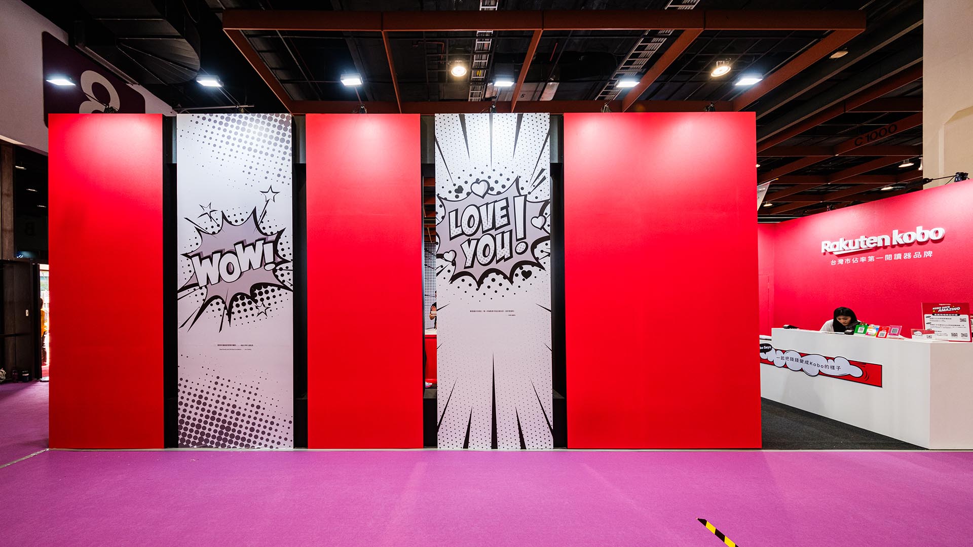
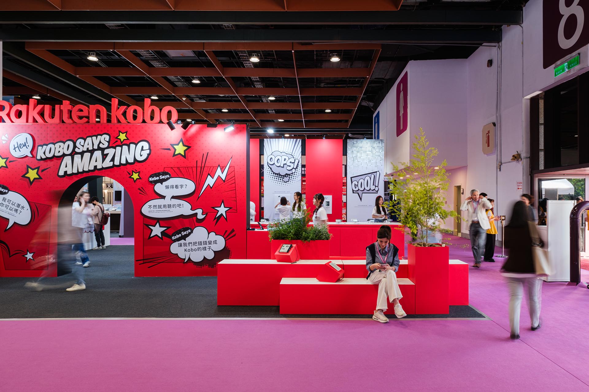
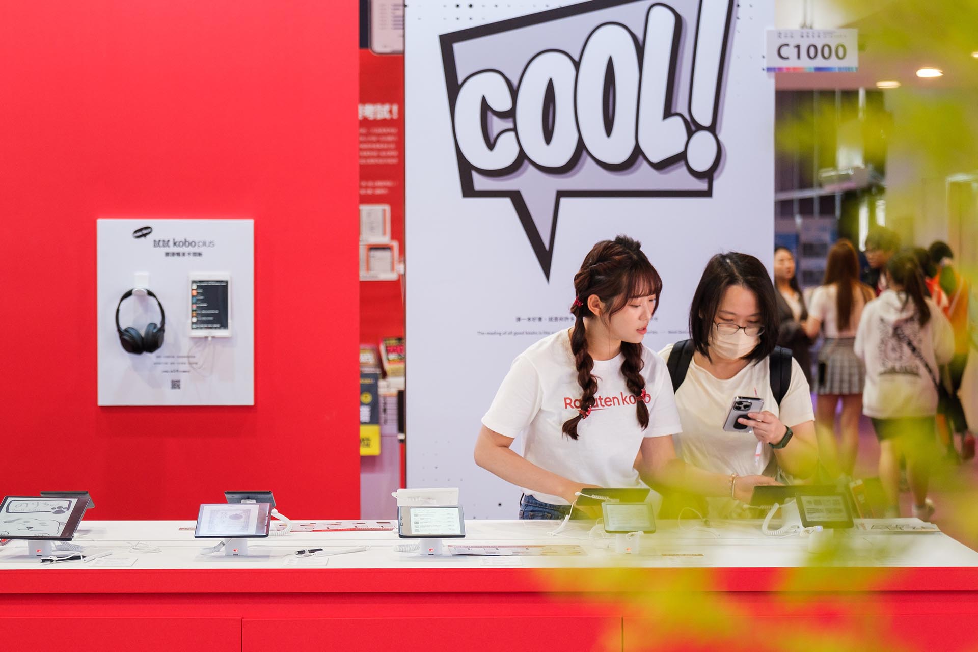
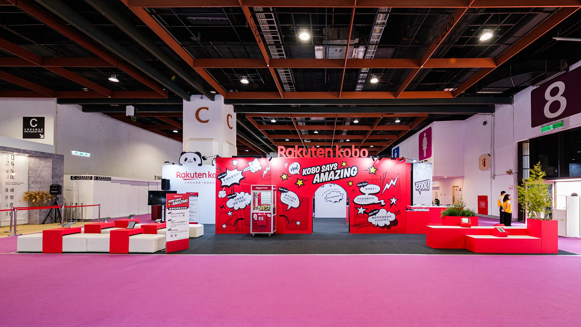
The exhibition design is based on the concept of "Kobo Says". The design adopts the idea of speech bubbles so that Rakuten Kobo e-book product information can be filled in every corner of the exhibition.
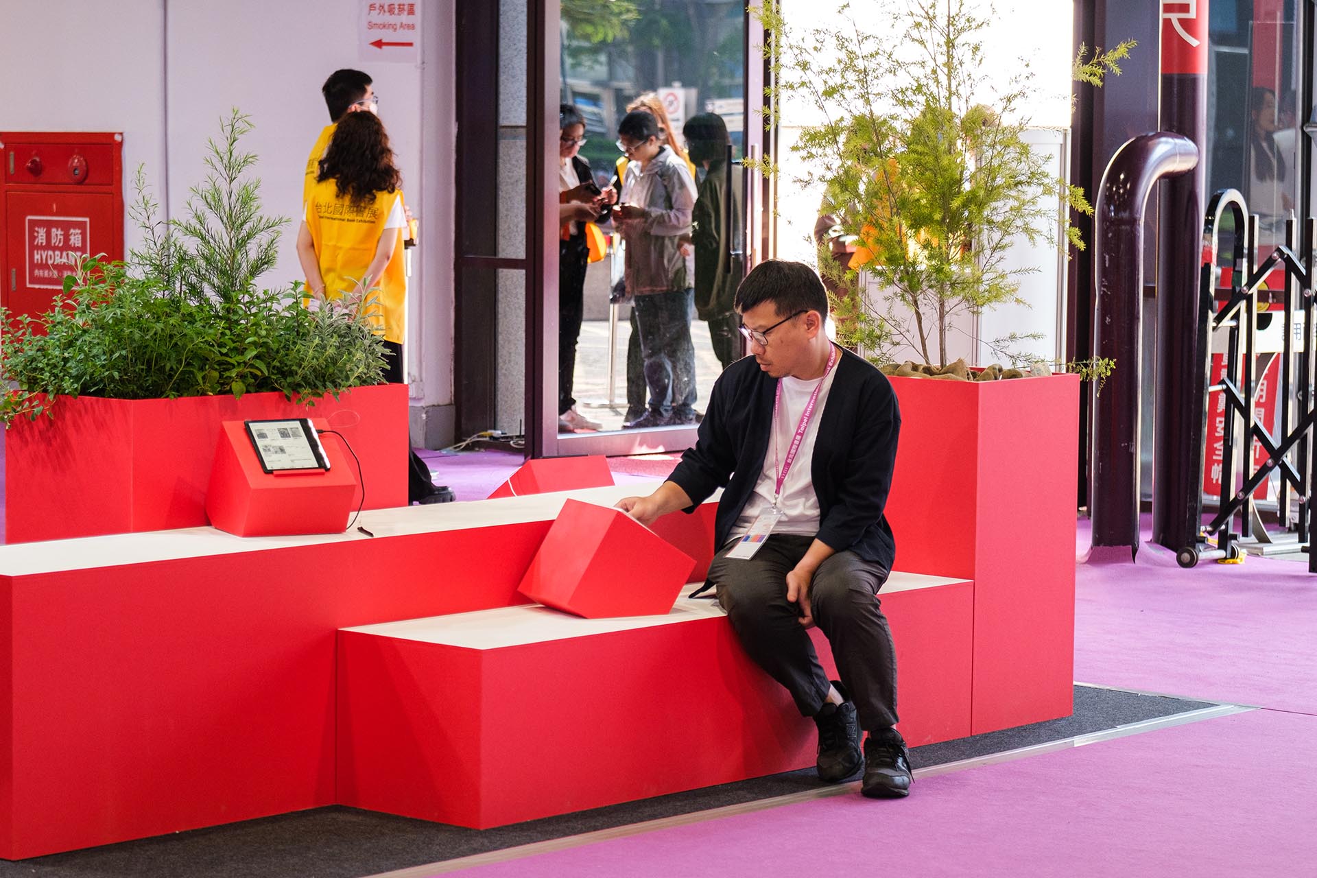
In terms of space tones, the three colors of black, white and red are used to strategically strengthen the Rakuten Kobo’s brand image. The space planning allows consumers to find their most comfortable corner and experience Rakuten Kobo e-book products.